Friday, November 27, 2015

Self Portrait

Assignment: Draw 3 self portraits. One self-portrait would be a standard self portrait. Let one self portrait be you making a funny, angry, or silly face. And let your last self portrait be something you think is really interesting.
 
 
I started out with 4B graphite pencil and finished with compressed charcoal. My family thinks that I look pretier than the drawing - ha ha ha. This is my first self portrait (the one I have truly put effort into it). Overall I am satisfied with the result. I am looking forward to the next two! 


I have chosen a different approach for the remaining two portraits. I have used 4B and HB graphite pencils. I have learned that portraits are not so scary matter, and with practice thing get better. I have had a difficult time with drawing humans but getting better now, and I actually enjoyed it. The hardest part was getting the dimensions right. Shading has been mastered with previous assignments, and I did not find it so challenging like glass (or transparent objects). 

Landscapes - Finished


1. Sketched landscape - Rodopa Mountain, Bulgaria
2. Finished landscape
 
I have used color chalk pastels to set the tones and basic shapes, blending the colors with a cotton ball. I have finished the drawing adding gouache paint to brighten up the colors, bringing the trees to a more natural look. Working in stages/ layers I have set apart the foreground and the background giving the painting more realistic look.

Landscapes

Assignment: Find 4 locations to draw landscapes from (these can be both urban and rural, but not imaginary). For each landscape, please use a whole page from your sketchbook. Take care and plan ahead if you know some great locations, but also don't forget to consider the different essences of the landscapes you are choosing.


I began sketching the landscapes, and I just could not stop myself of using color. All of the pictures for these were taken in Bulgaria (my home country). I have used graphite pencil for outlining, chalk pastels, and colored pencils, as well as newly discovered media - gouache paint. I usually use acrylic paint for my colored work, but decided to use something closer to water color. The gouache paint has great coverage without the shine of the acrylic. I have found it to be very versatile, and I like that it can still be diluted with water even after it dries up. The chalk pastels act a lot like compressed charcoal. They are very easy to blend, combine colors, and great for background. Harder to erase.
The work is not finished yet, just wanted to hear your opinions. Thanks!

1. Fall on a mountain road.
2. Christmas trees in Rodopa mountain
3. Black sea coast near my house in Bulgaria
4. Sea view (I went a little crazy with the colors on this one, just wanted to add more vibe to it)


Colored Pencils


Assignment: Find some items with great color and practice your skills. Break 3 pages into half-page illustrations each. Please remember to use the skills we learned in shape, form, mass, and volume to ensure that we are grounding our forms (not letting them float in space), and are paying proper attention to light, shadow, reflected light, and reflected shadows, etc.


My first drawing became a mixed media. I did not like how light the colors were so I added chalk pastels, and water colors. For the rest of the assignment I tried really hard to stick to pencils only. I ended up buying some Prismacolor pencils because mine were so hard I almost ripped the paper. Lesson learned: the softer the pencils the better the color vibrancy, and the coverage. They do not break easier just because they are softer.


Complex Shapes

Assignment: Create a composition with complex shapes. This still life should use a minimum of 5 items with complex shapes.
 
 
I went to a church in Raleigh with my drawing materials and sketch pad (my kids have Sunday school there), and while waiting I decided to do some work. I was not sure what to draw, and there it was right in front of me already set up for me ...the complex shape still life. I quickly snapped a picture of it because I knew that I would not be able to complete it in two hours, and started drawing. Here is the final result. I have used the usual materials so far: charcoal (compressed and vine), graphite pencil, eraser + something new - sharpie pen for some fine details, and dry erase marker for the thick black lines on the windows.

1,2,3 point Perspective


Using a single horizon line, create two one-point perspective drawings on the same page using any media you choose.

1. Asheboro, NC Zoo - Bridge in the kids area.
2. Cary, NC - Bond Park during Arts and Crafts Festival

 
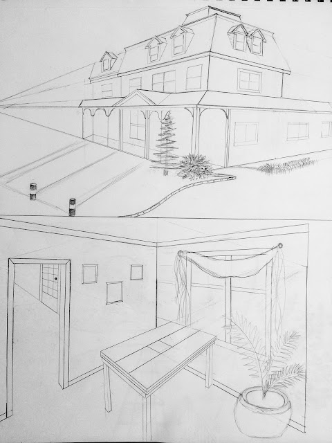
Using a single horizon line and a vertical central line, create two two-point perspective drawings on the same page using any media you choose.
 
 
1. Downtown Cary, NC - Page-Walker Center
2. Our dining room


Using a single horizon line as well as two additional vanishing points, create two three-point perspective drawings on the same page using any media you choose.
 
1. Seattle, WA - Space Needle
2. Shanghai, China - The Oriental Perl Tower

Form & Shape, Mass & Volume

Assignment: Find or create a composition which emphasizes Shape and Form, Mass and Volume. This can be something that you build- like a still-life, something you have seen or setup- like a photo you take from a real life situation, or something completely fanciful that you have chosen or determined on your own- an imaginary composition which emphasizes shape, form, mass, and volume.


After much debating what to have as my composition I have come up with a tea setup. I took the picture and began sketching. I am still in the very beginning stage. I will be using graphite pencil mostly and vine charcoal for shading later. I was tempted to use color as well. I have not decided for sure yet. I made a grid to properly align my objects. Later I will add the details and shading to the darkest object and finish with the lightest values.


To create this project I have put together a still life composition and I took a picture of it. The materials that I have used include graphite pencil for the outlining and details, charcoal pencil for shading, compressed charcoal for giving value to certain areas, vine charcoal for shading and adding value, and eraser for bringing up light values and reflections. Also finger for smudging, and paper stumps for blending. I have spent a fair amount of time on this project starting by outlining all the shapes, then I added base value to the tea pot, added all the detail and shading by leaving some white areas for the light reflections. I did very minimal erasing since I already had the light spots left from the beginning. The second object I drew was the cup with honey and the teaspoon. After that I drew the cinnamon sticks, and lastly the key hanger. I have finished my work by adding the shading for the drapery and all objects. Voila! I hope you enjoy!

Positive and Negative Space

Assignment: Find a chair to draw (more if you prefer) , preferably one with openings through the back, or with a complex leg structure.  Turn off the lights except for a single directional light source placed behind the chair.  Use pencil or charcoal pencil for this exercise.  Carefully observe the chair, and instead of drawing the positive elements of the chair, draw the shapes of the empty spaces around it, leaving the positive areas of the subject blank.  Work back into the negative spaces manipulating them by adding value, blurring, and smudging to create active spaces
 

Negative space surrounding the subject has the potential to be a dynamic part of the composition. I have used vine charcoal for the negative space filling it up, and leaving the positive space blank.

Light and Dark/ Volume

 Assignment: Choose a dramatically lit subject to sketch.  Begin by using your eraser to pull out specific areas of light throughout the image.  Use both kneaded and plastic erasers.  Only after you’ve pulled out all of the lights, then begin to add value in the darkest areas using compressed charcoal.  Use your chamois cloth to blend values.  Pay careful attention to the subtle changes between areas of lights and darks.
 

 By using paper that has been toned with charcoal, instead of white paper, you can easily achieve a richer, more dramatic, volumetric drawing. Tone a piece of paper in your sketchbook to a value of medium gray using vine or compressed charcoal, and then smooth it to an even finish with a chamois cloth, napkin, or paper towel.  Make sure that you achieve an even middle-gray value. 

Cross Contour

Assignment: Using your cross-contour technique, draw 4 separate images with clearly defined mass and volume. Use whatever materials or methods you prefer for this. Each image should be different.
 

I am finally getting more comfortable with the use of charcoal, thanks to this assignment. One thing that I have just realized was that I was forgetting to use the paper stumps. I was having a hard time to blend the charcoal and get sharp lines. Now I know why. Paper stumps are great they saved me a ton of trouble using the eraser. Another thing that I have realized is that I really liked having the background set at a certain value and then add highlights and shadows to get the finished look. This exercise was awesome, and I have learned more and got more comfortable with the mediums.

Paper Bag


Assignment: Use shading to lighten, darken, and blend your materials into a composition with a strong feeling and clear indication of the lighting, and strong variation in lightness and darkness of tone.
 

I have used vine charcoal more this time, and shaded with compressed charcoal. I used a very little graphite pencil just to make the outlines to stand out more. Overall I feel like graphite is still my favorite because I have more control on the lines that I draw, plus is less messy. I will probably still experiment with charcoal in the future assignments.

Pop Can

Assignment: Using shading, value, and color, make a monochromatic (one color only) drawing of a smashed can in your sketchbook. Include the can's surroundings, light reflections and shadows as necessary.
 
 
I decided to use as much charcoal as possible. Really tough. I am having a hard time mastering it. It goes really rough on the paper, I don't have a sharp line as I wanted to, too dark as well. Also another hardship I faced drawing with the eraser. I could not get a sharp line and a tiny dot as well. I think I will only use my graphite pen next time.

Texture Panel

Assignment: Using whatever materials and methods you desire, find 12 textures around and draw them in a separate box.
 

Texture is everywhere. Its what you feel, its how things look, its the tactile covering on many items.

1. Marble
2. Rug
3.Pine bark
4. bricks
5. cheese grater
6. grass
7. mums
8. side walk (the not slip surface at the end)
9. palm leaf
10. pebbles
11. wooden fence (sideways)
12. peacock feathers

Line

Objective: choosing the best composition out of the four previous sketches, re-draw it as a separate composition. Emphasize on creating a realistic look, using value, shading and light reflections.
 

Composition with Lines

Assignment: Set up a composition and draw it from four different angles emphasizing on the lines (interior, exterior, contours) Focus is on the interaction of the lines, and depth of the composition. Selecting the best composition out of the four, re-draw it as a separate rendering.
 

Lines and Mark Making

 Objective: Building gradations of color and exploring different mediums such as graphite and charcoal pencils, vine charcoal and compressed charcoal.


Simple Shapes / Squares and Circles


Exercised drawing 50 ellipses (circles and squashed circles) and 50 parallelograms (squares, rectangles, and squashed forms with parallel sides). Drawn from reference items (dinner plates, can of pop, fan, television, etc.) using different angles. Objective: use your whole arm when you draw these shapes, moving your elbows and shoulder to draw the shapes and pull your hands along. Do not use short, repetitive motions of the hand or wrist to make your shapes. Get your body into the movement for quicker, more fluid mark making.